
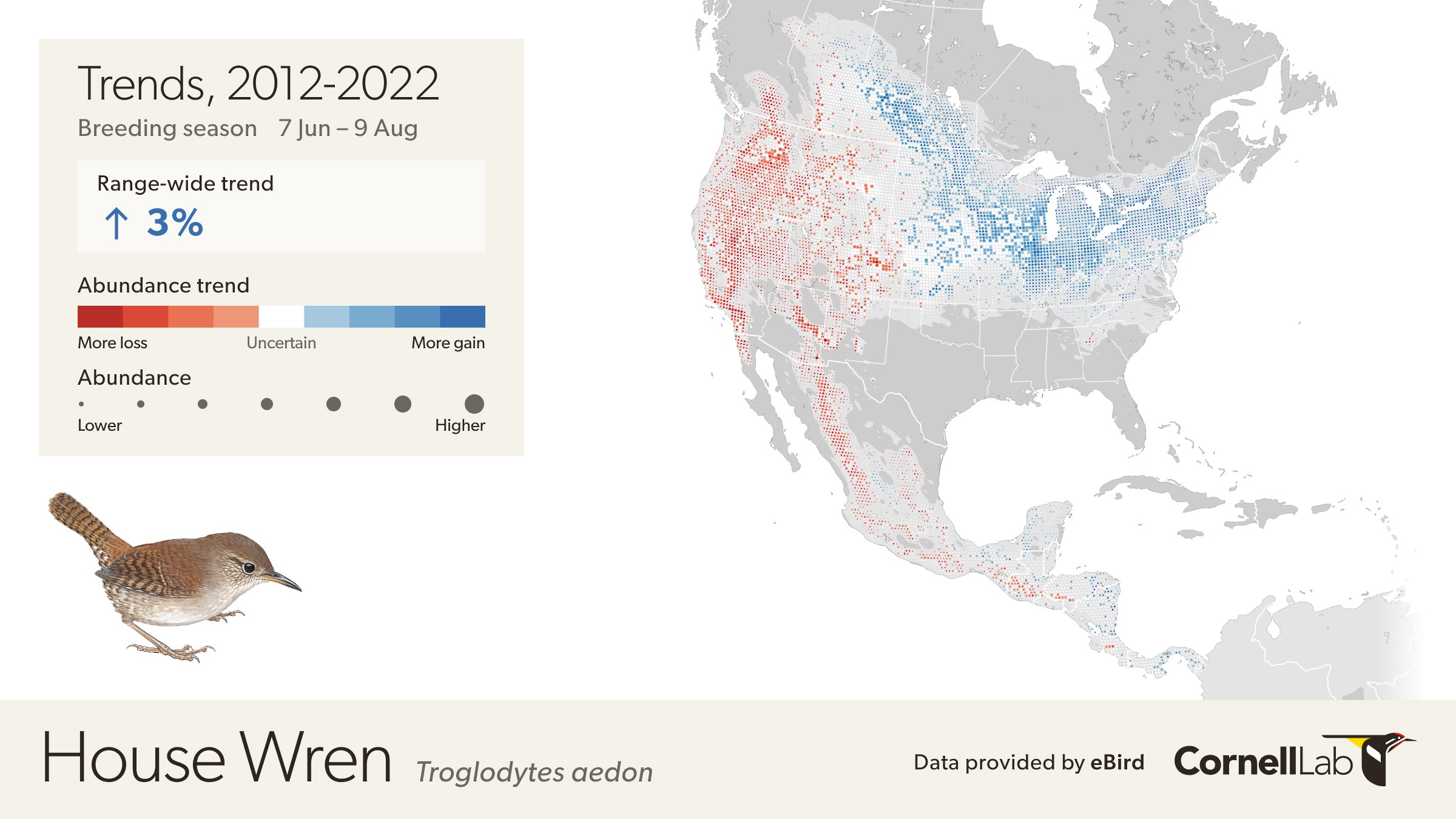
This map depicts the cumulative change in estimated relative abundance for House Wren from 2012 through 2022 with circles representing 27km x 27km regions. Red indicates decline and blue indicates increase. The darker the color, the stronger the trend. White circles represent locations where the trend estimate is not significantly different from zero (i.e., the 80% confidence interval contains zero). Circle sizes are scaled by the estimated relative abundance at the middle of the time period.
eBird Status and Trends products are updated annually with millions of new observations submitted by eBirders to provide the most up-to-date information on the status and trends of bird populations. This year, in addition to updating products with more data, the team released new tools with greater details to allow for precision conservation and to aid in our understanding of species distribution.
What’s new in 2023
- State and regional-level Trend summaries – Trends summarized by state/province with confidence intervals
- Download trend results – available for the first time, the data behind the Trends maps to allow for additional analyses
- More species – Status products (abundance, weekly, and range maps) are now available for 2424 species (160 more species than 2022). Trends are now available for 852 species across the globe
- Custom mapping tool and data summaries – draw shapes on the map to get the percent of the population within the specified area for more than 2,000 species. Available on abundance and weekly Status products. The custom mapping tool is not available for Trends
State and regional trend summaries
eBird Trends show where bird abundance has increased (blue), decreased (red), or where change has been uncertain (white) from years specified within a 27 x 27 km region (represented by a circle). And now for the first time, regional and state level summaries with detailed information on population trends are available for 852 species. These state/province and regional summaries are a great way to see how species are faring in specified regions and to identify where to focus conservation actions within states and provinces.
The value of the Trends regional summaries for conservation can be seen when examining the Greater Sage-Grouse. Fifty percent of the population of Greater Sage-Grouse has been lost since 1970 and they are at risk of losing another half of their remaining population if nothing changes, according to the 2022 U.S. State of the Birds Report. Conversion of sagebrush-dominated shrub-steppe habitat and disturbance have led to population declines, but identifying where to focus conservation efforts across their range can be challenging. eBird Trends present a more comprehensive snapshot of population health by allowing us to visualize changes in abundance at local scales. These maps help pinpoint exactly where populations are decreasing and increasing to help identify where to focus conservation efforts. Areas with greater numbers of individuals (larger circles) that are also darker red mean a larger proportion of the population has experienced a decline of a greater magnitude such as in Wyoming. In Wyoming Greater Sage-Grouse populations have declined by 30% from 2012 to 2022, but in Montana where there are also larger numbers of individuals, populations have increased by 14%. Zooming in more on Montana tells us that while populations are increasing overall, a few locations with red dots are showing decreases. These locations could be candidates for conservation action and have the potential to provide a good return on conservation investments because a larger percent of the population (larger dot) also occurs in the area.
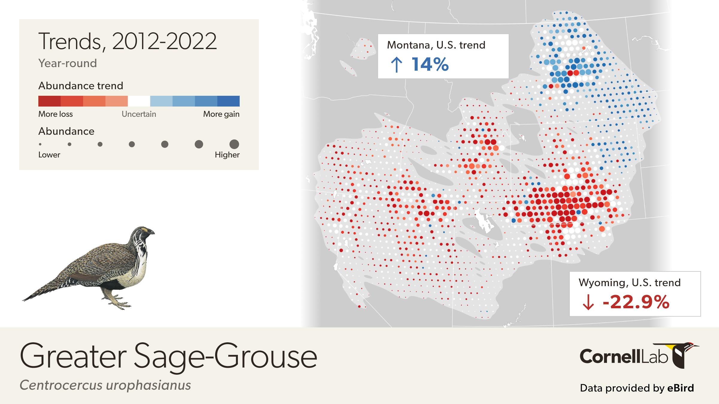
This map depicts the cumulative change in estimated relative abundance for Greater Sage-Grouse from 2012 through 2022 with circles representing 27km x 27km regions. Red indicates decline and blue indicates increase. The darker the color, the stronger the trend. White circles represent locations where the trend estimate is not significantly different from zero (i.e., the 80% confidence interval contains zero). Circle sizes are scaled by the estimated relative abundance at the middle of the time period.
Custom mapping tool and data summaries
Identify areas of importance
The new custom mapping tool lets users draw on relative abundance and weekly abundance maps to identify the percentage of the population within a specified area. This tool is particularly useful to assess areas of importance for birds that cross political boundaries.
Shorebirds, for example, use habitat all along the Pacific Flyway crossing multiple jurisdictions as they migrate to and from their arctic breeding grounds and nonbreeding sites throughout the Americas. State summaries of relative abundance are helpful, but the new custom mapping tool lets us estimate what percentage of the population specific regions support.
In southern California and northern Mexico, the custom mapping tool lets us examine relative abundance of Western Sandpipers across political boundaries. In this location, we see that nearly 10% of the population uses agricultural fields in and around Mexicali, el Centro, and Yuma as they make their way from the arctic breeding grounds. These fields are likely important stopover sites for Western Sandpipers, important details that can help inform conservation management work with local landowners to ensure continued habitat availability.
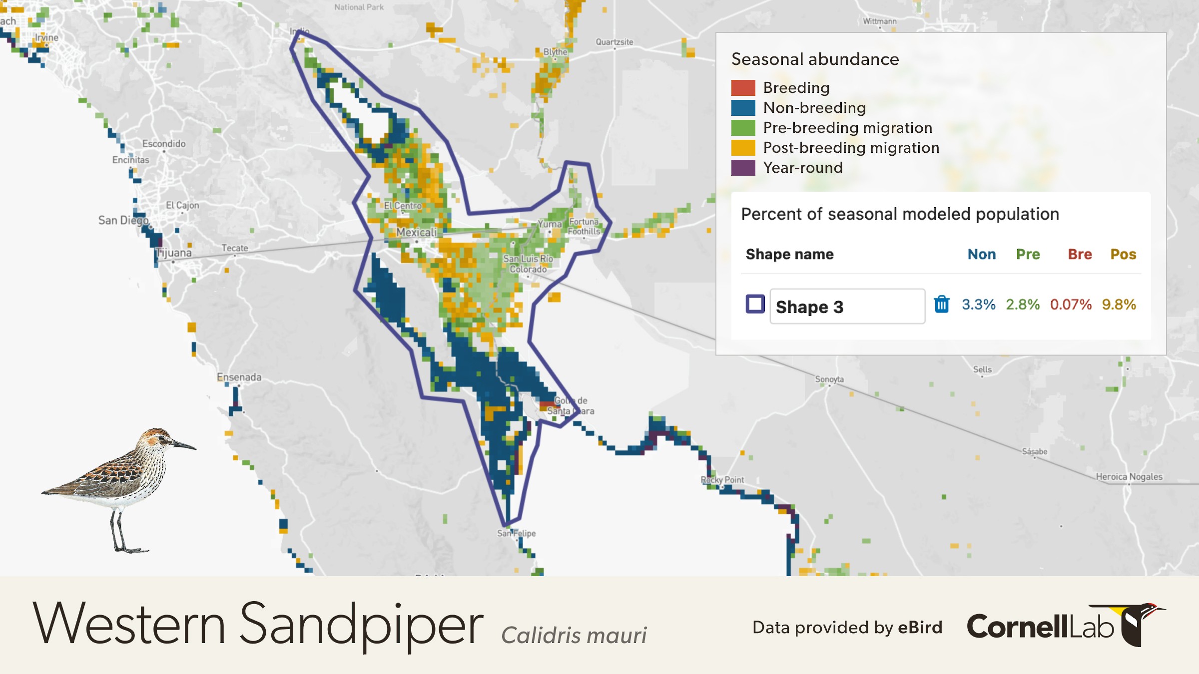
Relative abundance of Western Sandpiper in Southern California and Northern Mexico.
Discover when to go birding
On the weekly abundance maps, the custom mapping tool displays a graph of the percent of the population for each week, highlighting when species are expected to be more common.
Drawing a custom shape around where you live can help you pinpoint when the largest percentage of the population is likely to be present. In the example below, Connecticut Warblers are more common in the Chicago metropolitan area during the week of May 17 and the week of September 6—a great time to go looking for them during migration.
This tool can also help determine when species will be moving through certain areas to aid in planning for lights out periods to reduce bird collisions.
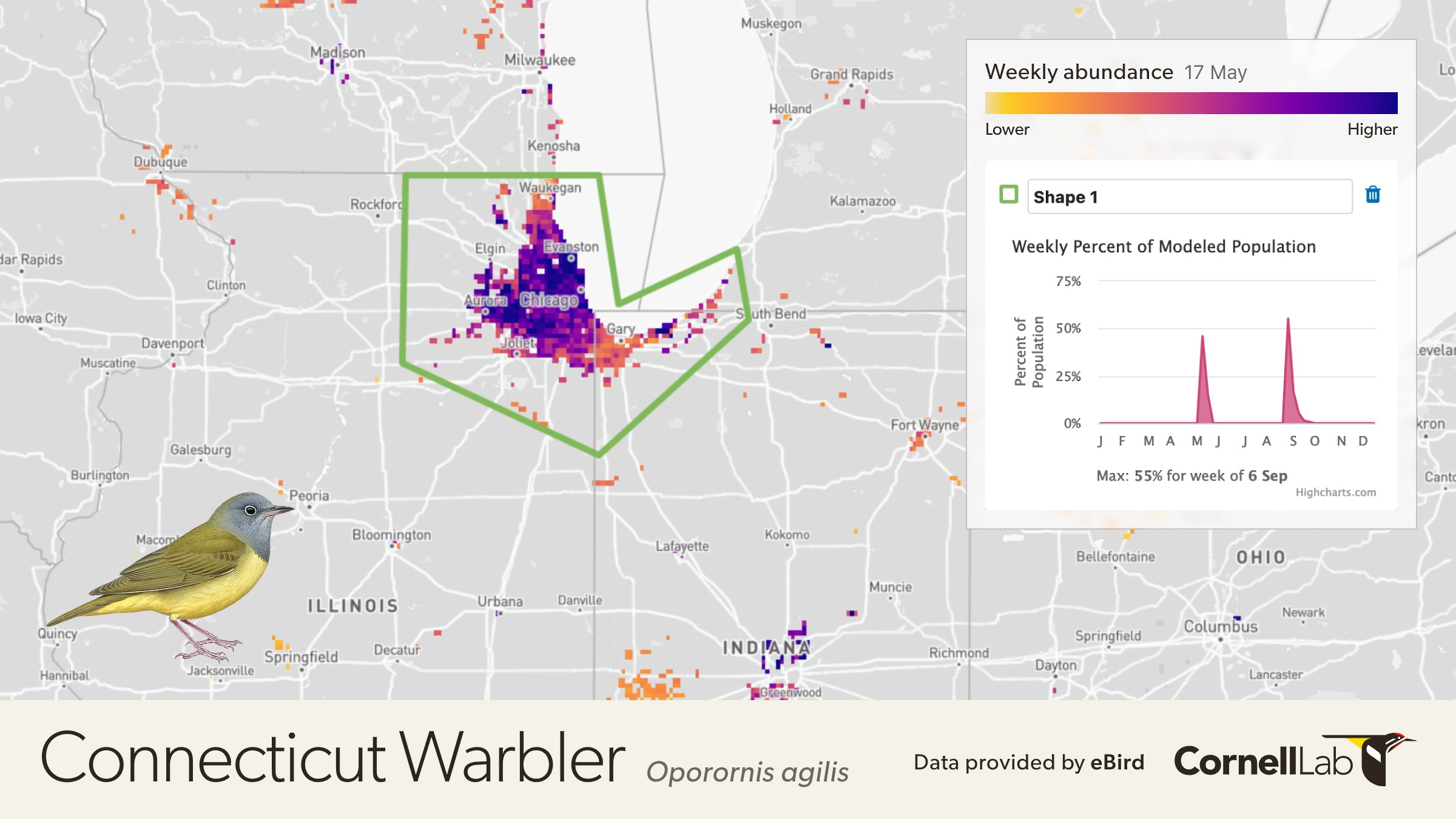
Estimates of relative abundance for Connecticut Warbler for every week of the year animated to show movement patterns. Relative abundance is the estimated average count of individuals detected by an eBirder during a 1 hour, 1 kilometer traveling checklist at the optimal time of day for each species.
How to use the mapping tool
The custom mapping tool is available for abundance and weekly Status data products. To get custom shape stats for a specific region, enable draw mode by clicking the square button in the top-left corner of the map or click the “Draw shape” button in the right-side panel. Reducing the layer opacity using the slider in the right-side panel will make it easier to see the underlying basemap. For more information on how to use the custom mapping tool see the FAQ.
After creating the new shape, the percent of the population for each season within the specified area displays on the right panel. Custom shapes will remain on the map as you change between data products and species, allowing you to compare the percent of the population for multiple species or compare across multiple areas of interest.
Download trend results
Trend results are now available for download to allow for custom data analyses. Downloading data products requires an access key tied to your eBird username, which you can get by reading and agreeing to our eBird Products Terms of Use. Data products available for download include: abundance geospatial data (raster), range and trends geospatial data (vector), regional statistics related to relative abundance and range boundaries (CSV), and trends with uncertainty. To learn more about all the changes and improvements for data products, visit our FAQ page.
More species
Trends maps for 852 species are currently available where the necessary data exists. Your eBirding can help that number to keep growing. As more eBird data comes in from more locations, eBird data scientists will be able to predict status and trends for additional species around the globe.
“We’ll be adding additional functions to eBird Trends moving forward,” said Lab geospatial data science lead Tom Auer. “It’s a credit to all eBirders that we were able to create this level of localization, to make a daunting environmental issue something that individuals can influence simply by reporting their backyard birds.”