
Global Patterns of Bird Abundance and Distribution Revealed for 1,009 Species

Every year the eBird Status and Trends project updates the abundance visualizations and range maps with millions of new observations submitted by eBirders to provide the most up-to-date information on the status and trends of bird populations. This year, the team modeled relative abundance for 1,009 species across the globe using data from more than 300,000 eBirders.
What’s new for eBird Status Visualizations
- A global view—global relative abundance and range maps for 1,009 species; 202 additional species this year
- eBirders filled in data gaps
- 36.1 million eBird checklists—a 28% increase in number of checklists
- 374,682 eBirders contributed data—a 20% increase from last year
- 11 million unique locations— an additional 4 million locations since last year
- Non-migratory (resident) species get a boost—new methodologies helped model resident species using a full year of data
- New insights into poorly understood species
- Unique phenomena revealed
- Habitat regional charts highlight global habitat associations for all 1,009 species
- New variables to improve model performance
- Hourly weather to account for variation in a birder’s ability to detect birds and a bird’s availability for detection
- Better data on nighttime lights
- Higher resolution data for elevation, bathymetry, and topography
- eBird data from 2006-2020 with relative abundance estimates provided for 2020
- Improved taxonomy browser—browse species by region
Explore eBird Status and Trends
A global view
Thanks to new and improved modeling methodology and the ever growing global network of eBirders, the eBird Status and Trends project modeled 1,009 species across their entire global range for the first time.
I had the pleasure of sharing a sneak peek of the new global relative abundance animations with Mike Brasher, waterfowl scientist at Ducks Unlimited and Tom Moorman, retired chief scientist at Ducks Unlimited. I loaded up the relative abundance animation for Gadwall, an unassuming dabbling duck, that occurs over much of the Northern Hemisphere and let the animations run. “Wow, that’s interesting,” chimed Moorman, quickly followed by an “Oh wow,” from Brasher.
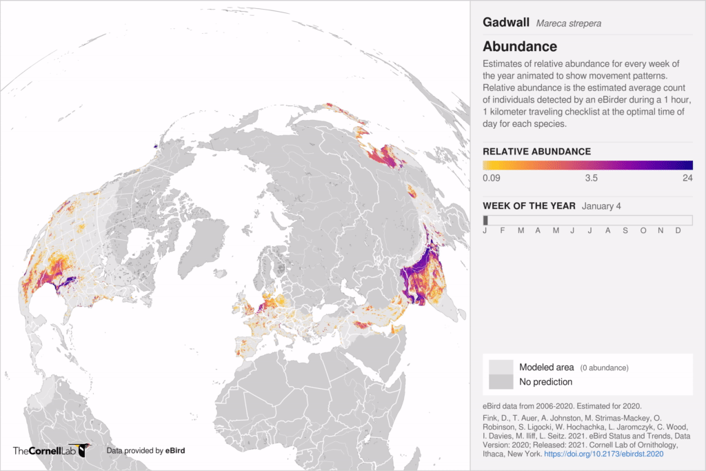
Estimates of relative abundance for Gadwall for every week of the year animated to show movement patterns throughout its range.
They continued to gasp in amazement as the animation played through. Then we got into the details; we advanced the map week by week and examined hotspots across the globe. “The maps really opened my eyes to additional areas that hold concentrations of waterfowl,” said Moorman, “I had no idea the concentration of birds in Mongolia and China.” Indeed areas in Mongolia, China, and southeast Asia support fairly large concentrations of Gadwall and other waterfowl (Russia may also support large numbers of waterfowl, but there are not enough eBird observations from Russia to support accurate models). Seeing those concentrations sparked a lot of questions from both Moorman and Brasher about everything from migratory paths to land use in the region.
The eBird Status visualizations are more than just a way to visualize concentrations of birds throughout their annual cycle, the visualizations can also open pathways for engagement and conservation. “Just seeing the distribution and movement patterns creates opportunities for conservation of habitat at scale,” says Moorman. “The maps really light up important places to start talking with others and to learn about what they are doing for conservation,” said Moorman. “We are such place-based people,” said Brasher, “we know where the hotspots are in our areas, but to be able to see bird distribution at a global scale, well it helps us build connections and helps us think about conservation from a global perspective.”
Behind all of the super computing necessary to create these visualizations are the eBirders who shared their observations. “These maps are especially impressive in that what we are seeing is leveraging citizen science data and for the first time have a useful tool to think about and visualize waterfowl conservation from a global perspective,” said Brasher.
eBirders filled in data gaps
The Blue Rock-Thrush is a relatively common bird across Eurasia inhabiting rocky slopes, cliffs, and valleys. But prior to this year, there were not enough observations of Blue Rock-Thrush in eBird to produce reliable estimates of abundance.
More than 6,000 eBirders from Spain to China filled in the gaps to allow the team to model the expected relative abundance of Blue Rock-Thrush. “The fact that we’re able to build a representation of the range of Blue Rock-Thrush, all the way from Spain to Japan, using data from eBirders in every one of these countries is absolutely stunning,” says Tom Auer, Geospatial Data Science Team Lead at the Cornell Lab of Ornithology. The relative abundance animations, Auer says, “go beyond the traditional range map, with weekly estimates of relative abundance, providing a more detailed picture. This just hasn’t been possible before at this scale.”
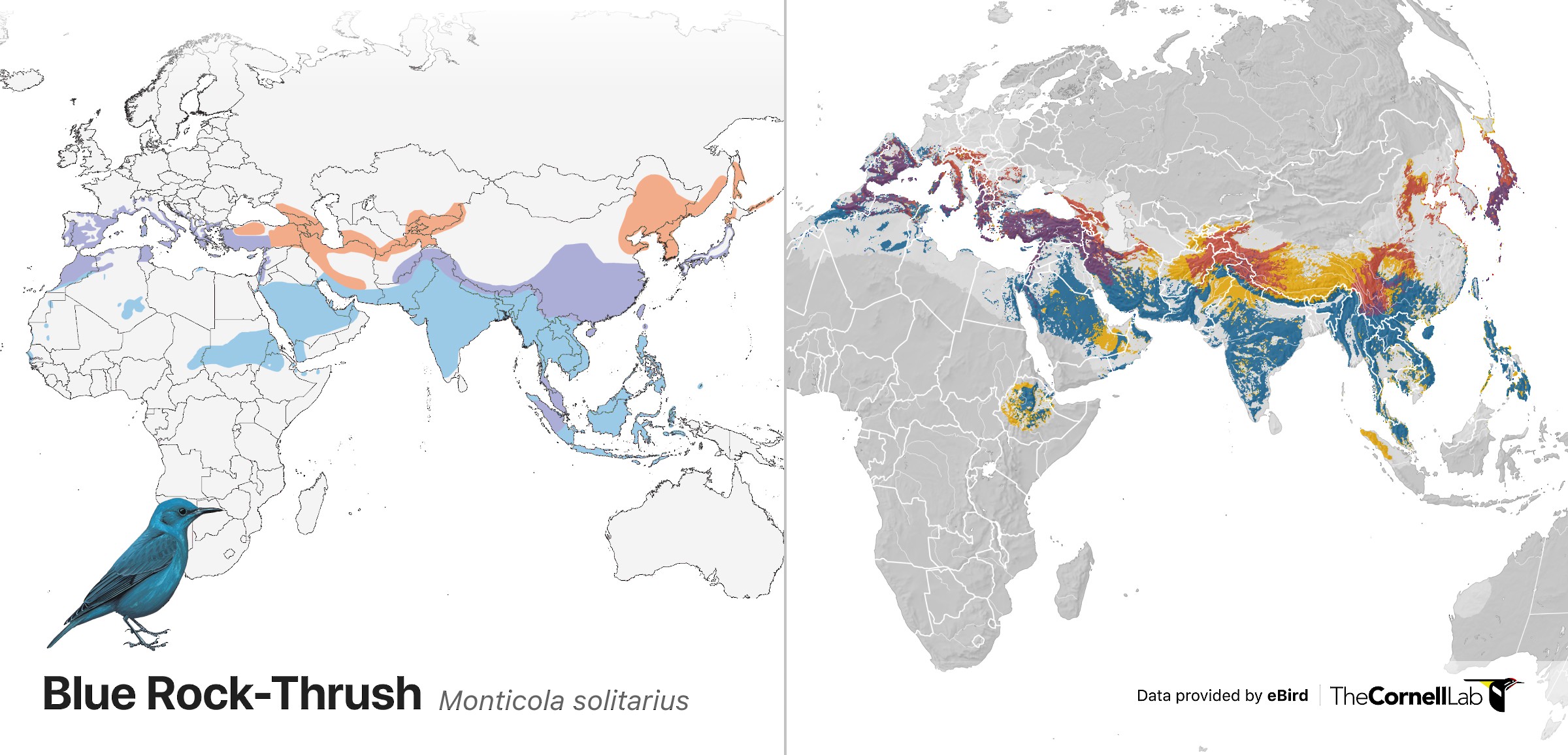
The traditional range map of the Blue Rock-Thrush from Birds of the World (left) and the relative abundance range map from eBird Status and Trends project (right). Blues indicate nonbreeding, purples indicates year-round, pink/red indicate breeding, and yellow indicates pre- and post-breeding movements. Blue Rock-Thrush illustration © Tim Worfolk/Lynx Edicions
Non-migratory species get a boost
Thanks to improved statistical modeling techniques, the team was able to incorporate observations for resident/non-migratory species for every day of the year. In years past, the team only used data from one month throughout the year which limited their ability to accurately predict relative abundance of species with fewer eBird observations. “Now that we are treating resident species differently than migrants, we can use more of the available data,” says Auer. “The new resident methodology allows the team to model hundreds of additional species than they were able to in the past, including range-restricted species with little data.”
“Being able to accurately predict relative abundance of resident species outside of North America is a win for conservation and for our partners who are working hard to protect their resident birds that are often threatened,” says Viviana Ruiz Gutierrez, assistant director of the Center for Avian Population Studies at the Cornell Lab of Ornithology.
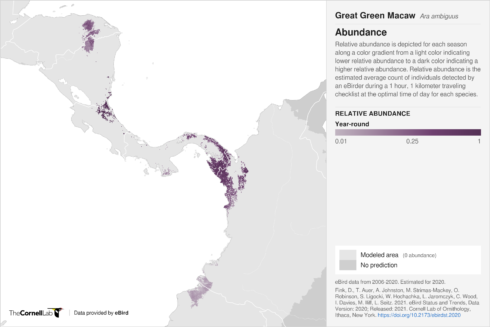
Relative abundance estimates depicted for the year-round range of the Great Green Macaw. Areas shaded darker purple indicate higher relative abundance.
The Macaw Recovery Network seeks to protect parrot populations throughout Central America, but for effective conservation they need to know where parrots, such as the critically endangered Great Green Macaw, occur throughout their range. “Parrots and macaws move around the landscape a lot, so it’s difficult to detect them with standardized bird surveys—you really can’t count them without citizen science data,” says Gutierrez. The new relative abundance visualizations provide range-wide estimates of relative abundance that organizations like the Macaw Recovery Network need for effective conservation planning with partners.
In previous years, many of the species that the eBird Status and Trends project modeled in Colombia were migratory birds, but many of the species that are threatened or endangered in Colombia are resident species. This year’s new methodology allowed the team to model 96 resident species in Colombia, providing organizations such as Instituto Humboldt with information they need to make conservation decisions.
Lina Sánchez-Clavijo, adjunct researcher in the biodiversity assessment and monitoring program at Instituto Humboldt is really excited about the eBird Status and Trends visualizations. “Having these new visualizations for resident species,” says Sánchez-Clavijo, “will be very useful for Instituto Humboldt because people want to know what species are present on their land to aid in conservation planning, for licensing requirements, for bird tourism, or to answer scientific questions.” The visualizations, Sánchez-Clavijo continues, “will be really good for answering questions related to requirements but also for analyses to help us better understand where species richness might be greatest in Colombia or where more of our threatened resident species occur.” Because Colombia doesn’t have a national biodiversity monitoring program, “Status and Trends visualizations could help us quickly see which species might be declining and where,” said Sánchez-Clavijo.
The eBird Status and Trends visualizations also offer a lot more detail than field guides. “You can see relative abundance and how abundance varies across the Andes,” said Sánchez-Clavijo, “that’s really important for us.” The visualizations also provide a look at the full distribution of a species, not just where it occurs in Colombia. Sánchez-Clavijo, who normally picks up a Colombia field guide whenever she has a question, was astonished when she saw the relative abundance visualization for the non-migratory Yellow-legged Thrush. “I had no idea that it also occurs in Brazil, so it’s good to see the context and the whole distribution of a species,” said Sánchez-Clavijo.
Insights into poorly understood species
In Chile, the migratory routes for the Giant Hummingbird are still a mystery, says Ivo Tejeda, executive director at Red de Observadores de Aves y Vida Silvestre de Chile (Chilean Bird and Wildlife Observer Network). Despite being the largest hummingbird species in the world, the Giant Hummingbird only weighs 20 grams, about the weight of a AA battery, and may move over 13,000 feet between its breeding and nonbreeding grounds. This phenomenal elevational migration got Jessie Williamson, a PhD student at the University of New Mexico, wondering about the physiology of the Giant Hummingbird that makes these movements possible. Williamson is using geolocators, tiny devices that track the movements of individual birds, to begin unraveling their migratory patterns and their physiologies that make large elevational movements possible.
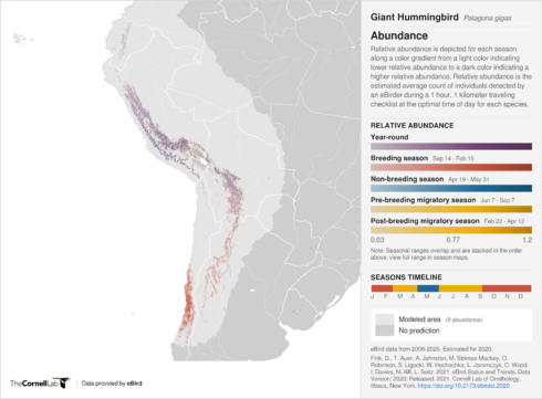
Relative abundance estimates for Giant Hummingbird within each season. The darker colors indicate higher relative abundance
Tejada is excited to compare the results from Williamson’s geolocator work with the data from the eBird Status and Trends visualization to better understand not only the Giant Hummingbird’s migration patterns, but also where Giant Hummingbirds are expected to be in Chile.
Unique phenomena identified
eBird Status and Trends visualizations are great tools for conservation planning, but they can also help birders see unique phenomena not captured by traditional range maps.
Tree Swallows are a familiar sight in summer fields and wetlands across northern North America. In winter they spread out across the southern United States, Mexico, and Central America. At least that is what a traditional range map shows us.
Tree Swallow range map indicated distribution during the breeding (pink), nonbreeding (blue), year-round (purple), and pre- and post-breeding movements (yellow). Map data are provided by NatureServe in collaboration with Robert Ridgely, James Zook, The Nature Conservancy – Migratory Bird Program, Conservation International – CABS, World Wildlife Fund – US, and Environment Canada – WILDSPACE. Modified by Neotropical Birds
“But when we look at eBird Status and Trends visualizations, we see that the worlds’ entire population of Tree Swallows packs into a few areas including Florida, Baja California, and central Mexico—a comparatively tiny fraction of their breeding range,” says Jenna Curtis, eBird project leader at the Cornell Lab of Ornithology. “A traditional range map,” says Curtis, “doesn’t adequately convey these incredible concentrations of Tree Swallows.”
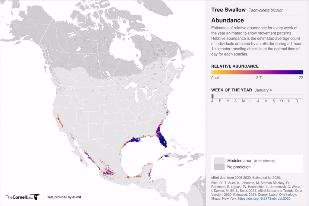
Estimates of relative abundance for Tree Swallow for every week of the year animated to show movement patterns throughout its range.
Curtis recently traveled to Little Saint Simons Island where she witnessed several thousand Tree Swallows feeding in a wax myrtle grove. “It was a really amazing moment, and eBird Status and Trends visualizations gave me a much greater appreciation for what I was seeing,” said Curtis. “By placing my observations into the ‘bigger picture,’ eBird Status and Trends visualizations made this special birding moment even more impressive.”
Habitat regional charts highlight habitat associations globally
Habitat regional charts are now available for all 1,009 species and include habitat associations across a species’ entire range, not just the Americas. The expanded habitat associations charts help visualize how species associate with different habitat types throughout the year, expanding our knowledge base and sparking new research questions to investigate. They also allow researchers, land managers, and decision-makers to identify the important habitats that support species in different places and at different times of the year.
Barn Swallows are the most widely distributed swallow in the world, but like other aerial insectivores their populations have been declining throughout much of their range. Causes for the decline have not been fully established but research points towards agrochemicals and climate change.
Across much of their breeding range, the habitat regional charts indicate that Barn Swallows are positively associated with dense herbaceous vegetation, but in some areas during migration large concentrations of Barn Swallows are associated with herbaceous croplands—locations where they could be exposed to agrochemicals. Along the eastern coast of the Mediterranean Sea, for example, large numbers of Barn Swallows pass through Lebanon where they are associated with herbaceous croplands (pink). A similar pattern is evident along the Gulf of Mexico where large concentrations of Barn Swallows move south through Tamaulipas, Mexico stopping in herbaceous croplands to fuel up before migrating farther south.
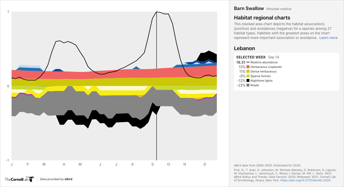
Habitat regional chart for Barn Swallow. The stacked area chart depicts habitat associations (positive) and avoidance (negative) for different habitat types. In Lebanon, Barn Swallows are positively associated with herbaceous cropland.
While the habitat regional charts do not imply that association with certain habitats cause population changes, the visualizations can be used to examine additional research questions to help pinpoint what might be causing population changes. Having access to habitat associations at specific locations throughout a species range is another tool researchers can use to further their research.
Powered by eBirders
Every checklist you submit allows the eBird Status and Trends team to refine and expand status and trends for more species, more regions, and with more precision. Thank you for sharing your sightings with eBird—together we are creating a better understanding of birds around the world. We can’t wait to see what you report in the coming months. Visit our help center to get tips on how to make your checklists count for science.
Request Status and Trends Data Products for research and conservation
Status and Trends Data Products featuring the 2020 updated dataset will be available for use on June 1, 2022. Please see the terms of use and fill out a data request form to access Data Products from 2019.
eBird Status and Trends visualizations and regional stats tables for 2020 can be downloaded free of charge with a Lab of Ornithology account.